What A United Way Looks Like
About an hour north of our offices in Michigan, the city of Grand Rapids is once again hosting ArtPrize. Now in its fifth year, ArtPrize is described as “a radically open, independently organized international art competition.” It consumes downtown Grand Rapids with over 1,500 art pieces from outdoor statues and installations, to paintings and sculptures displayed in public spaces and commercial establishments. It is must-see art – well worth the trip – and all free!
I spent a half-day at ArtPrize yesterday, and perhaps I saw a hundred or so of the art pieces on display, leaving so much more unseen than seen. However, I found one particular piece spoke volumes to me about United Ways. Check this out:
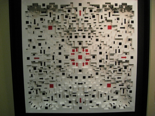
This four-foot, square piece was created by East Grand Rapids, Michigan artist Eric Broekhuis. He describes his piece as a geometric sculpture cut and folded from a single sheet of watercolor paper. What you cannot see from the picture is that there is about three inches of depth to the piece as the paper is cut and folded to form a three-dimensional work of art.
I looked at this piece for a moment and it struck me that this is a picture of a United Way. Every United Way seems to be going in a lot of directions, on different levels, all at the same time. I think the different levels could represent different aspects of United Way, such as allocations or resource development, or maybe they represent each staff member at a United Way wearing a variety of hats and saddled with many responsibilities. When you try to describe what a United Way does to someone, and you talk about the large number of programs, partner agencies, goals, and outcomes, you could well be describing this work of art.
After a couple of moments soaking up the details and nuances of what seems to me to be the ideal picture of a United Way, I cast my gaze to the right of the piece to find that the name of the piece is “Directionally Challenged.” The title makes it absolutely apparent that the artist, Eric Broekhuis, was inspired to create this piece by one or more United Ways.
Does your United Way look like Eric Broekhuis' piece, "Directionally Challenged?" Are there just too many arrows at your United Way? Does the ideal United Way have just one arrow and move in a unified manner in one direction? I think one arrow might be unattainable, but I am also convinced that too many arrows is unsustainable. Over the past couple of years, the most common request we have received from presidents and CEOs of United Ways is to help their United Way focus, especially as it relates to community impact.
When you draw a picture of your United Way, how many arrows does it have? And, more importantly, how many arrows should it have?
